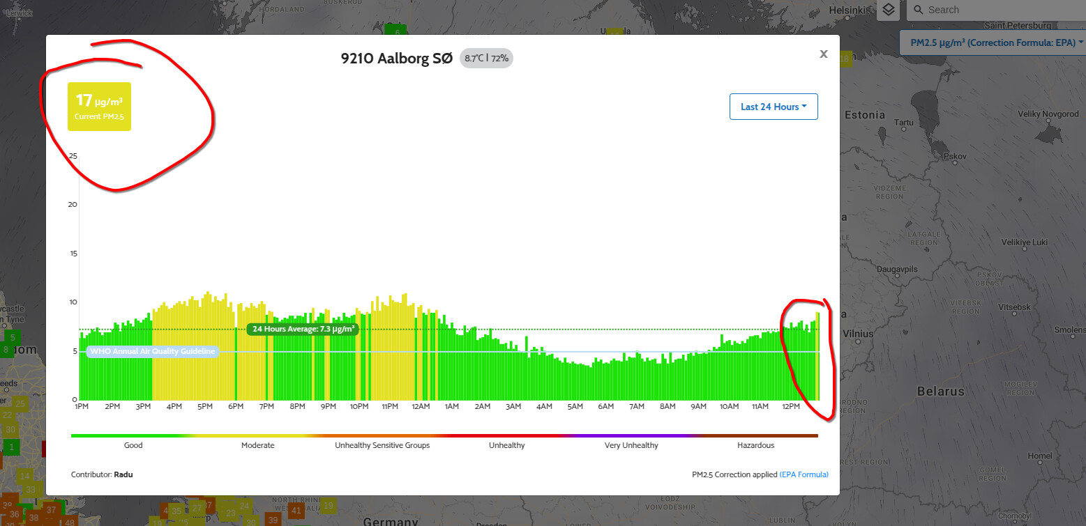
This is the case for most readings on the map. Current value matches the the dashboard values but the graph does not
I noticed the same problem with my unit (and others)
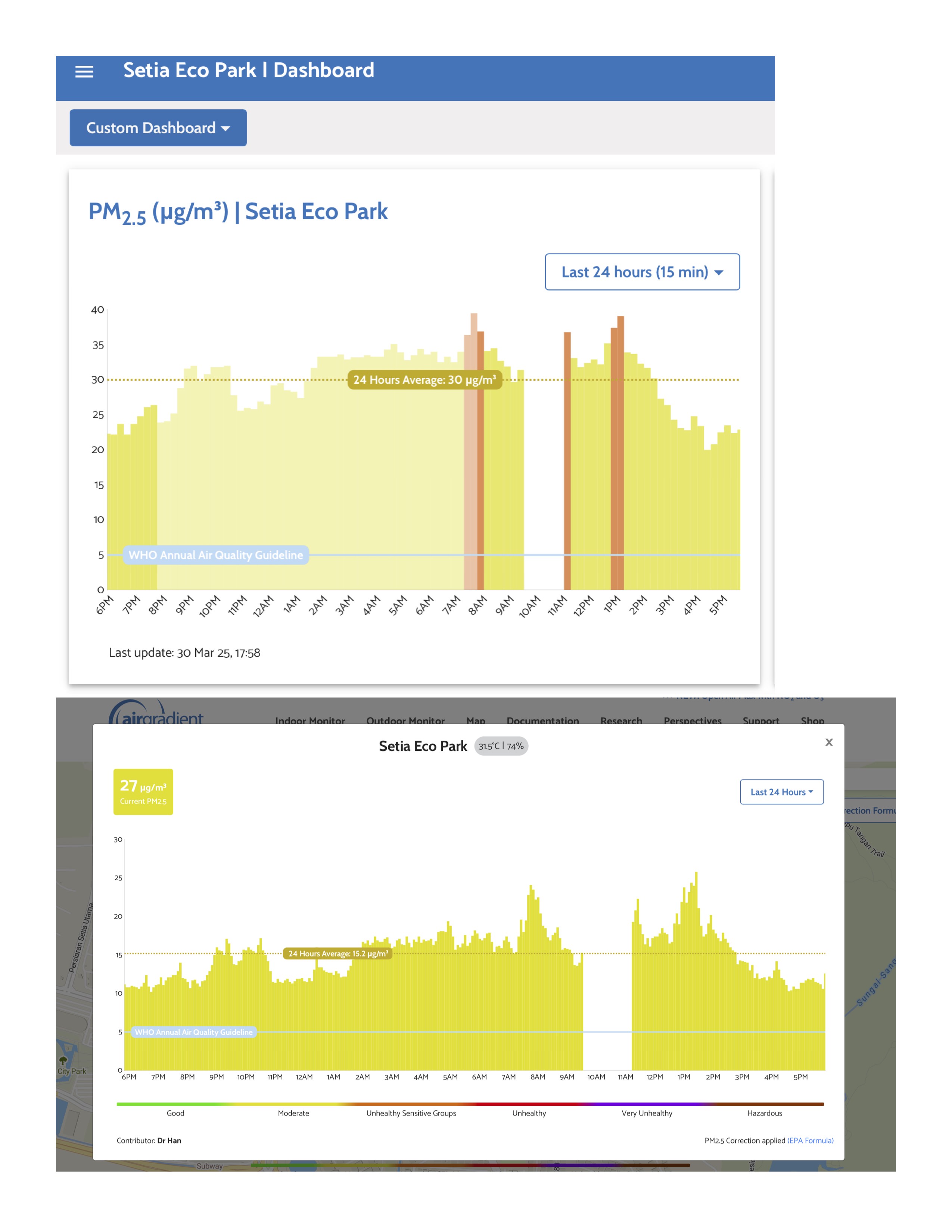
Noticing this issues well, tried restarting but makes no difference. Current value on the map and graph is different, and different again for the dashboard as well. Dashboard here shows value in the red but map does not show record such value.
The PM2.5 values can be raw or corrected. The raw values are often around 50% higher than corrected. Maybe that’s the reason for the observed difference.
Both the dashboard and the map can show raw and corrected PM2.5 based on the settings.
Map:
drop-down menu top right
Dashboard:
sensor-specific “Advanced settings” (3 vertical points on the right end of the table with real-time data)
We know that. But switching to the uncorrected value on the map results in yet another set of values
Yes I do know that, both are also showing corrected value. In any case the dashboard, whether it’s raw or corrected value, reflect the value on the graph accurately, as in for that hour if it’s around 35 units, it would show the bar peaking around 35 for that period of time. But on the map itself, the bar on the graph would be consistently lower than the current value (when there’s no fluctuation in the value), and does not tally with the dashboard. Even if I switch the map to raw it would still not tally. This issue only started on 3 days ago for me.
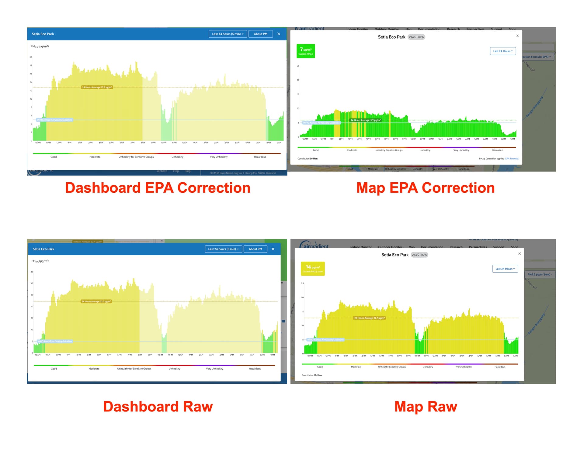
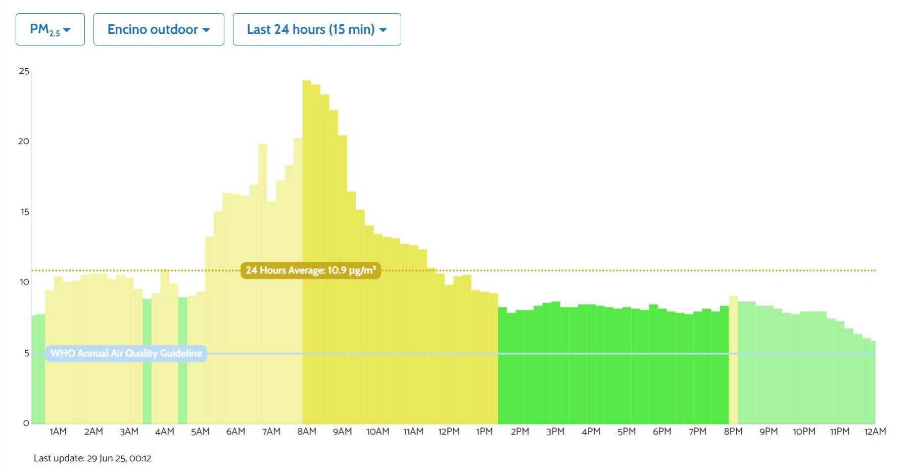
Let me show u in this screenshot. Dashboard is set to both raw and corrected value, map show both raw and corrected value graph. All are 24 hours timeframe with 5 minutes interval. Dashboard EPA correction show a 24-hour average around 12.8 with bar peaking close to 30 while Map shows 5.9 with bar peaking close to 10. For raw value, dashboard show 24-hour average of 22.2 with bar peaking close to 35, while map show 24-hour average of 12.7 with bar peaking close to 20.
1 Like
I’m experiencing the same issue–the reading from the map is consistently lower than that from the dashboard by 3-4 ug/m3.
Hi everyone!
Our team is currently looking into this.
Seeing the same issue here as well. Dashbord values and values seen locally match, but the map is not even close . . . Local and dash showing AQI of 26, map shows 11. Switching to particulates has the same ratio . . .
1 Like
Yehor, any update on when this will be fixed?
1 Like
Same problem - any progress?
I also noticed also that the map at windy.com displays a value that is different from the dashboard and the airgradient map. The map at openaq, although not precise, seems to be the most accurate.
Not sure if/what may have occurred, but after a couple weeks of being whacked, my data has started to report correctly for about the last 24 hours. Hopefully, that sticks . . .
I also have this problem.
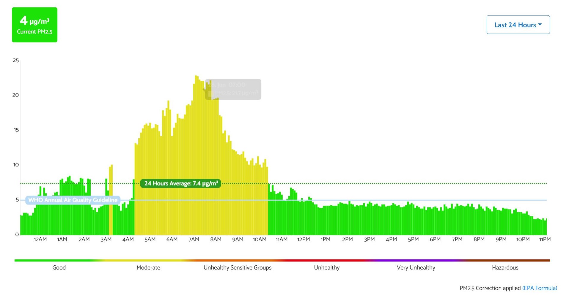
My reading on my app dashboard does not match the reading on the map, but if you click on my sensor the chart matches my app.
I’m guessing the map value is corrected with US EPA but the chart is not.
Also, I can no longer find the option to show corrected data in my dashboard. I don’t have ‘advanced settings’ as an option, only ‘general settings’ and this doesn’t include anything about whether to show corrected values. It used to be an easy toggle between corrected or not corrected but this option seems to have totally disappeared.
Hi @Bangkokdi,
The ‘Advanced Settings’ menu is on a per monitor basis and can be found when you click the three dots in the far-right column:
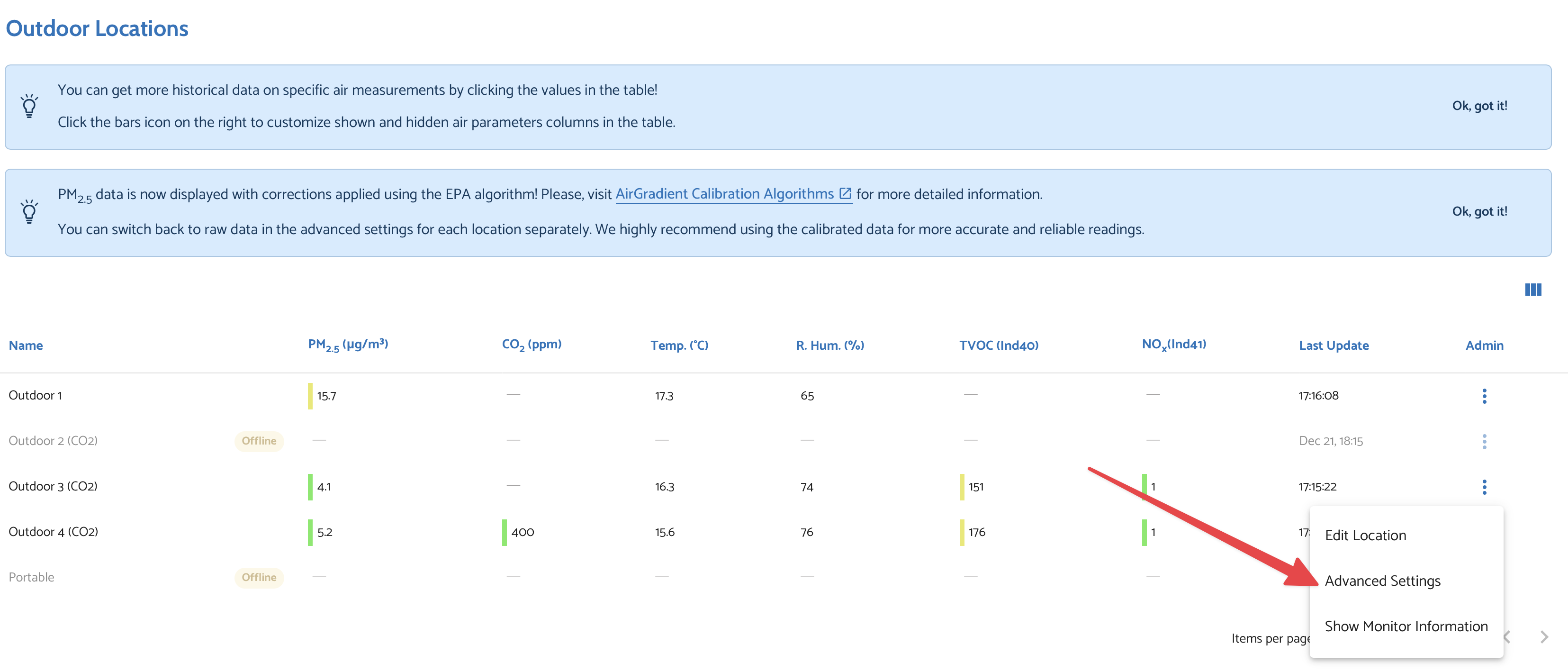
Whatever corrections/calibrations you apply via that menu are what will show for that monitor on your dashboard.
I have set that, and the dash and map still radically differ (despite using the same data source).
(And yes, while things seemed to get better for a while mine are divergent again).
Frankly, publishing how the map derives the value displayed (from the same data shown on the dashboard) would go a long way to understanding this . . .
Please not that this is the Air Gradient dashboard not agreeing with the Air Gradient map! No third party displays are relevant in the issue that I am seeing - just Air Gradient displays!
(FWIW, I am set for "US EPA everywhere, but see the same disgrepancy using ug/m)
1 Like
Sorry for the confusion on my end.
The difference in readings between the dashboard and map largely comes from two factors:
-
The map doesn’t have batch-corrections applied. If you have applied one of the sensor corrections on the dashboard, this will instantly cause a difference in readings between the two.
-
Different bucket sizes. The map uses 15-minute minimum buckets, whereas the dashboard can use down to 5-minute.
Data on the dashboard is generally more precise (and up-to-date) for these reasons.
1 Like
Hopefully this makes it clear how crazy it is that batch corrections aren’t on the AirGradient map and hopefully it is being addressed.
If AirGradient wants to be known for reliable and accurate devices, then anything that this device shows or reports to other destinations (AirGradient’s map itself, API endpoints, or 3rd party maps and aggregates) should default to using the corrected values and a user should have to very intentional choose to report only raw and inaccurate data.
2 Likes
I thought the corrections were downloaded into the monitor, and any device getting the data could get the corrected data? They clearly are applied to what I get in Home Assistant and your dashboard, so it’s hard to comprehend how those same corrections could not be used on the map by default. As stated prior by another - with the new PM sensor need for batch calibration, the data is pretty much garbage at low PM2.5 comcentratioms without them.
1 Like
Agree with this. I gather the data from the AirGradient device directly using the device’s internal API and my RemoteWeather software. I could add support to correct the readings to RW if I had to, but I would much prefer that the device correct readings automatically.
Ethan, are you guys applying these corrections on the (Airgradient-hosted) database side?
Do the raw readings I get from the device using the /measures/current HTTP endpoint have corrections applied?
Could you share your code that applies corrections to the various sensor readings? I want to incorporate the corrections into the (open source) RemoteWeather software.
1 Like
I’ll take a stab that the compensated values are those with “compensated” in the name. From mine:
{
“pm01”: 1.83,
“pm02”: 4.83,
“pm10”: 5.5,
“pm01Standard”: 1.83,
“pm02Standard”: 4.83,
“pm10Standard”: 5.5,
“pm003Count”: 339.67,
“pm005Count”: 300.83,
“pm01Count”: 55.33,
“pm02Count”: 11.67,
“atmp”: 16.5,
“atmpCompensated”: 14.37,
“rhum”: 63.4,
“rhumCompensated”: 87.16,
“pm02Compensated”: 6.24,
“rco2”: 465,
“tvocIndex”: 78,
“tvocRaw”: 33377,
“noxIndex”: 1,
“noxRaw”: 21398.75,
“boot”: 25070,
“bootCount”: 25070,
“wifi”: -61,
“serialno”: “d83bda1e1e94”,
“firmware”: “3.3.9”,
“model”: “O-1PST”
}