AirGradient Forum

AirGradient Go's menu is crazy annoying? - Feedback needed

Hey everyone,

It’s Tai again. I hope you are having a wonderful day. I’m here to ask for your feedback on how you would like to see the menu user interface of the AirGradient Go improved.

(I know some folks are still waiting for their preordered Go. We are sorry for the delay, and please rest assured that we are doing our best to deliver it to you as soon as we can). We are also happy to hear your thoughts even if you don’t currently have a Go.

To give you a bit more context: On our lovely Monday (maybe?), as usual, we have a weekly technical support meeting. And the previous Monday, I brought up my part regarding the AirGradient Go (I have been testing new firmware). Then Achim asked me, “What is annoying for you when you tested”?

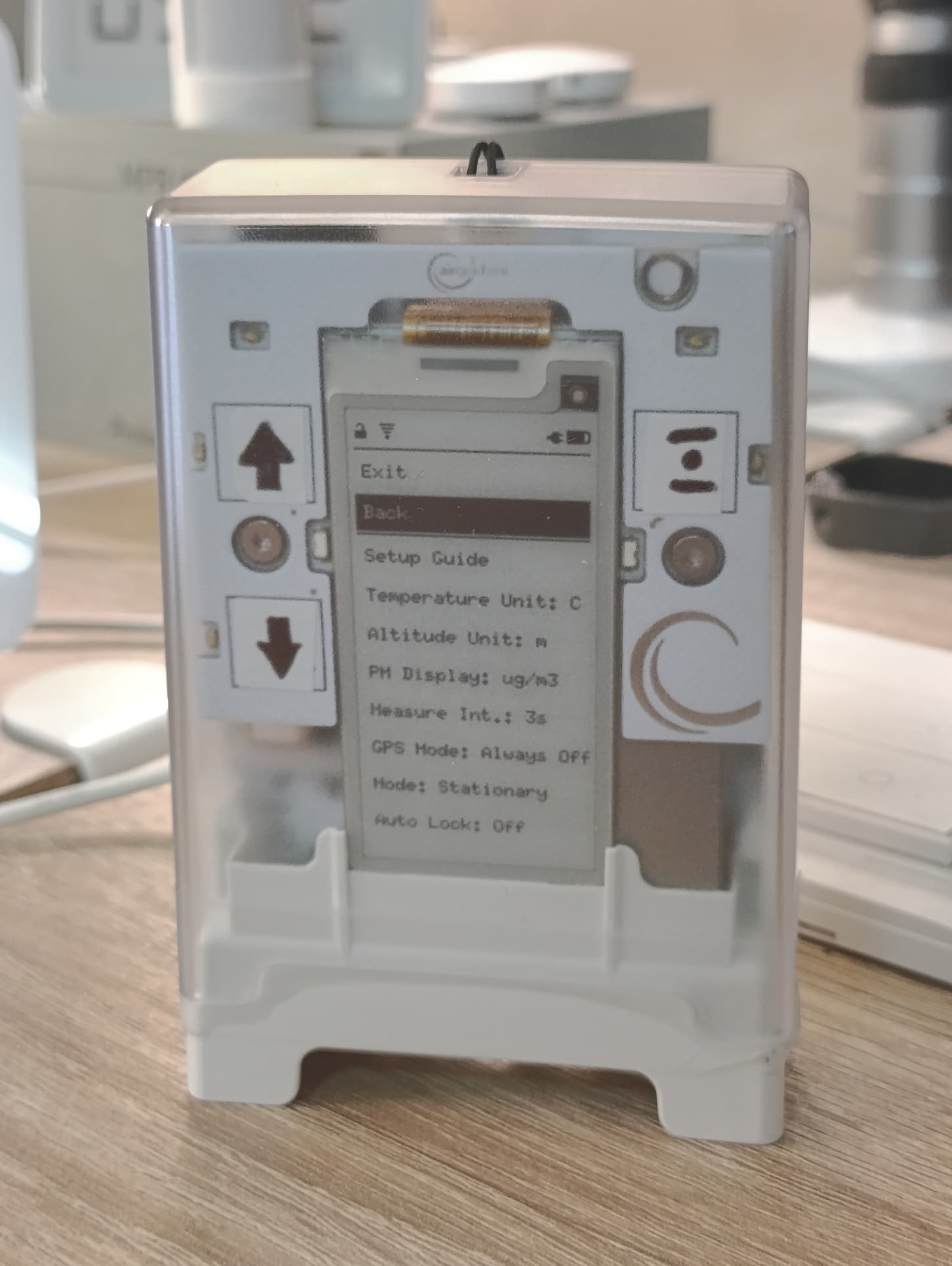
Of course, testing firmware requires repetitive interaction with the device, whether physically or by observing something via the serial log, app, Bluetooth, API, etc. One of my annoying lists is the menu UI, as it takes multiple steps (up, down, enter) until I can get to where I want. More importantly, our Go users gave us some feedback that dealing with the current UI is not very pleasant, as discussed here: AirGradient Go - Bugs/Issues/Feedback .

  • This is the current menu of the AirGradient Go: Let’s call it an OG (original), please click ‘Click to reveal’ below to see it (I don’t want to make this post too long).
Click to reveal
AirGradient Go - Current OG Menu (firmware v1.1.2)
└── Main Menu (all menus expanded)
    ├── Exit Menu
    │
    ├── Start Tracking / Stop Tracking
    │
    ├── Settings
    │   ├── Setup Guide
    │   │
    │   ├── Temperature Unit
    │   │   ├── Celsius
    │   │   └── Fahrenheit
    │   │
    │   ├── Altitude Unit
    │   │   ├── Meters
    │   │   └── Feet
    │   │
    │   ├── PM Display
    │   │   ├── µg/m³
    │   │   └── USAQI
    │   │
    │   ├── Measurement Interval
    │   │   ├── 3 seconds
    │   │   ├── 10 seconds
    │   │   ├── 30 seconds
    │   │   ├── 60 seconds
    │   │   ├── 5 minutes
    │   │   ├── 15 minutes
    │   │   ├── 1 hour
    │   │   
    │   │
    │   ├── GPS Mode
    │   │   ├── Always Off
    │   │   ├── On When Tracking
    │   │   └── Always On
    │   │
    │   ├── (Operating) Mode
    │   │   ├── Stationary
    │   │   ├── Portable
    │   │   └── Offline / Airplane Mode
    │   │
    │   ├── Auto Lock
    │   │   ├── Off
    │   │   ├── 10 seconds
    │   │   ├── 30 seconds
    │   │   └── 60 seconds
    │   │
    │   ├── Display LED
    │   │   ├── Off
    │   │   ├── Dim
    │   │   ├── Medium
    │   │   └── Bright
    │   │
    │   ├── AQI LED
    │   │   ├── Off
    │   │   ├── Dim
    │   │   ├── Medium
    │   │   └── Bright
    │   │
    │   ├── Touch LED
    │   │   ├── Off
    │   │   ├── Dim
    │   │   └── Bright
    │   │
    │   ├── Buzzer
    │   │   ├── Off
    │   │   └── On
    │   │
    │   ├── Play Melody
    │   │   ├── Chime
    │   │   └── Tetris
    │   │
    │   ├── CO₂ Calibration
    │   │   └── Confirm
    │   │       ├── No
    │   │       └── Yes
    │   │
    │   ├── Clear Data
    │   │   └── Confirm
    │   │       ├── No
    │   │       └── Yes
    │   │
    │   └── Hardware Test
    │       ├── Peripheral Test
    │       ├── GPS Test
    │       ├── Accelerometer Test
    │       └── Fuel Gauge Learning
    │
    └── About Device
        ├── Firmware Version
        └── Serial Number


So we agreed that it is obvious that we need to make some improvements to the UI.

Afterwards, I came up with a Base Draft here (also click to reveal):

Click to reveal
Base Draft:

AirGradient Go - Base Draft
└── Main Menu
    ├── Exit Menu
    ├── Start Tracking / Stop Tracking
    ├── (Operating) Mode            <-- Moved to higher level from OG Settings
    │   ├── Stationary
    │   ├── Portable
    │   └── Offline / Airplane Mode
    ├── Calibration                  <-- New Main Menu (compared to OG)
    │   └── CO₂ Calibration          <-- Moved to higher level from OG Settings
    │
    ├── Settings
    │   ├── Operations                     <-- New Submenu (compared to OG)
    │   │   ├── Measurement Interval  
    │   │   ├── GPS Mode
    │   │   └── Buzzer
    │   ├── Display & Touch
    │   │   ├── AQI LED
    │   │   ├── Auto Lock
    │   │   ├── Temperature Unit
    │   │   ├── Altitude Unit
    │   │   └── PM Display
    │   ├── Setup Guide
    │   └── Clear Data
    │
    └── About Device
        ├── Firmware Version
        ├── Serial Number
        └── Hardware Test            <-- Moved from OG Settings
            ├── Peripheral Test
            ├── GPS Test
            ├── Accel Test
            ├── FG Learning
            └── Play Melody            <-- Moved from OG Settings


And these are the proposed revisions for the Base Draft from our team members:

  • Option A

Keep the highest-level menu with 4 options. Keep the CO2 calibration under ‘Settings’ to prevent accidental CO2 calibration.

Note: items marked with ‘…’ are just placeholders.

Option A:

Main Menu
├── Exit Menu
├── Start Tracking
├── Operating Mode
│   ├── Portable
│   ├── Stationary
│   └── Offline
└── Settings
    ├── Operations
    │   ├── Measurement Interval
    │   ├── CO2 Calibration
    │   ├── GPS Mode
    │   └── Buzzer
    ├── Display Touch
    │   ├── All...
    │   ├── ...Display
    │   ├── ...And
    │   ├── ...Touch
    │   └── ...Settings
    ├── Setup Guide
    ├── Clear Data
    ├── Hardware Test
    │   ├── All...
    │   ├── ...Hardware
    │   └── ...Test
    └── About Device

  • Option B

Keep only one level under ‘Settings’. CO2 calibration moved to a higher level for easier accessibility. Get rid of ‘Operations’ (under ‘Settings’) in the Base Draft.

Note: items marked with ‘…’ are just placeholders.

Option B:

Main Menu
├── Exit Menu
├── Start Tracking / Stop Tracking
├── Calibration
│    └── CO₂ Calibration
│
├── Settings
│   ├── (Operating) Mode           <-- Moved from Base Draft's Main Menu 
│   │   ├── Stationary
│   │   ├── Portable
│   │   └── Offline / Airplane Mode
│   ├── Measurement Interval   
│   ├── GPS Mode                 
│   ├── Buzzer            
│   ├── AQI LED           
│   ├── Auto Lock
│   ├── Temperature Unit           
│   ├── Altitude Unit              
│   ├── PM Display                 
│   └── Clear Data
│
└── About Device
        ├── Firmware Version
        ├── Serial Number
        ├── Setup Guide                <-- Moved from Settings (compared to Base Draft)
        └── Device Tests               <-- New 2nd level (compared to Base Draft)
            ├── All...
            ├── ...Hardware
            └── ...Test

  • Option C

Put ‘Modes’ in the top level; it contains 2 submenus: 1) Operating Mode and 2) GPS Mode for use cases where users just want to collect air quality data and leave GPS out.

Option C:

Main Menu
├── Start Tracking / Stop Tracking
├── Modes    <-- New Main Menu
│   ├── Operating Mode            <-- Moved from Base Draft's Main Menu
│   │   ├── Stationary
│   │   ├── Portable
│   │   └── Offline
│   └── GPS Mode                    <-- Moved from Base Draft's Settings
│       ├── On When Tracking
│       ├── Always On
│       └── Always Off
├── Calibration
│   └── CO2 Calibration
├── Settings
│   ├── Measurement Interval
│   ├── Buzzer
│   ├── AQI LED
│   ├── Auto Lock
│   ├── Temperature Unit
│   ├── Altitude Unit
│   ├── PM Display
│   └── Clear Data
├── About Device
│   ├── Firmware Version
│   ├── Serial Number
│   ├── Setup Guide
│   └── Device Tests
│       ├── Peripheral Test
│       ├── GPS Test
│       ├── Accel Test
│       ├── Battery Calibration
│       └── Play Melody
└── Exit Menu


My question is: which Option do you think is the best, and why? And if you have any ideas, please feel free to make your own proposal!

You can just make a simple suggestion if you don’t want to make a tree chart like the one we show above.

Yeah, please don’t hesitate to make any suggestions. We would like to hear from our community!

Good day,
Tai

1 Like

Hi @Tai_AirGradient,
While I don’t have the Go yet, I like option C.
Maybe Device Tests could also be on the first level menu to perform a test before starting tracking.

Also I presume that Bluetooth and Wifi are configured in the Setup Guide ? In my future setup I’ll may have to use different hotspots on the fly.

1 Like

I prefer Option A over the other options because the setting I use the most is changing the operating mode. However, I would most prefer the ability to customize the menu, ideally through the phone app.

For example, I use a Pebble Time 2 smart watch which gives me that option considering it released with similar button controls (no touch screen) to the AirGradient Go. Since then, that’s changed for the watch so it’s not quite as necessary, but it was extremely helpful especially when there was no touch screen on the watch. Considering there is no touch screen on the Go and the button controls are not very responsive, I think this option would be even more helpful.

1 Like

Hey guys, thank you for the feedback!

@Alpha, the config for Portable Mode (Bluetooth) VS Stationary Mode (Wi-Fi) is currently in the ‘(Operating) Mode’ according to the OG menu. It’s buried quite deep in the menu. I agree that we want to put it on the first level (main menu). I use this switch quite often too.

The Setup Guide just only shows a QR code to our quick start guide on the knowledge base page: AirGradient Go: Quick Start Guide | AirGradient Knowledge Base

@jjbonta, that sounds interesting. Is it fully customizable? For example, can we move a menu that is located deep down in a lower level to the top-level menu?

1 Like

Only the top level can be customized. Maybe it could be different for the Go, but because the Pebble Time 2 menu is just a bunch of apps, it makes sense that you can only customize the app locations. Within each app there are differing levels of customization.

I do also think that in general those who appreciate open source and repairable products tend to also appreciate plenty of customization.

1 Like

Exactly, I’d love as much customizability as possible too. And being able to customize it through the mobile app is a cool idea!

Anyway, based on the current menu on your device. Which do you think should be moved to/removed from the main menu (the top level), besides the Mode (Portable, Stationary, Offline) that you already mentioned?

1 Like

If we don’t get the ability to customize the menus ourselves or even if we do, I think I prefer Option A as the default layout. Until I use it though, I can’t say for sure.

The only other setting I might want on the main menu would be the Measurement Interval. Everything else I don’t use very often, but maybe I should.

1 Like

I agree that of the two options Option A seems to have my more used functions closer to the top with fewer taps to access. Although ideally there would be some way to change operating mode or trigger a manual sensor refresh without going into a menu, with some kind of physical button combo or other gesture so it’s more or less instant.

Is it possible to do touch button combos? For example, could “exit menu” or a “back” function be done with tapping the select button twice? Or tapping both up and down arrow buttons together? Or the up button + select button together? If it’s possible to use multi-button or combo patterns on the touch buttons, maybe that’s another option for triggering things like operating mode or sensor refresh, in a way that overrides the menu lock?

Ex: With the menu locked, tap the select + up button to jump to an operating mode setting screen?
Ex 2: Tap the select button 3 times quickly to trigger a manual sensor refresh even with the menu locked?

1 Like

Thank you for your suggestions guys!

@vlotty, I discussed triggering a manual sensor refresh with our engineer. He was quite positive about this request. We will let you know if there’s an update.

Hi folks!

Thinking long-term here. Judging from the evolution of the firmware, it will gain more settings over time. This creates a dilemma between conflicting requirements:

  • Sometimes I want to access things quickly.
  • Other times, I want many settings. If there’s hardware, let me control it, all of its options.

One way to deal with this may be to support multiple menu structures, and switch between them. Something like this:

Settings -> Settings mode -> [All, Simple, Custom]

Extending this, the ability to name and store multiple custom menu structures would make it easy to evaluate them. Applying this to the OP, keeping its names:

Settings mode -> ["Original", "Base Draft", "Option A", "Option B", "Option C"]

1 Like

Hi @rainer, welcome to our community!

Thank you for giving us a fresh perspective! That’s a cool idea.

May I ask which functions you think should be accessed quickly and which are rarely used, according to your use case? Thanks!

For context, I do not have the Go yet, I just played with the simulators and read the OP.

Answering your question:

Use case: Monitor home office air quality (AQ). Then cycle to office, monitor street-level AQ. Then monitor office AQ. Cycle back, repeat. Observe any correlation between AQ and cognitive performance.

Guessing frequency of functions use:

My guess is that I would most often switch between “Portable” and “Stationary”.

Least often used, from less often to more often:
“Serial Number”,
“Temperature Unit”,
“Altitude Unit”,
“Setup Guide”,
“Firmware version”
“Auto Lock”,
“Clear Data”,
“Device Test”

More thoughts:

For those whose goal is to “minimize the number of button presses needed”, this is related to optimizing encoding, also known as data compression. In this view, menu leaves are represented by a “path”, which is a sequence of presses of the “down” and “select” buttons. The path must be “prefix-free” (see Wikipedia, can’t post links) - No menu leaf’s path can be a prefix of another leaf’s path.

  • Tame Idea: Gather usage statistics (frequency of navigation to leaves of the menu tree, and the button sequences used to reach them) on the device.

  • Optionally, give users the option to (anonymously) share the statistics.

  • Crazy idea, having a little fun here: Provide a settings mode “Auto-optimized”, that automatically (on-device!) reconfigures the menu structure to minimize the expected path length, the need for navigation. The optimal structure depends heavily on the de-facto usage, that’s where the statistics come in. The vague idea is “Huffman coding” (see Wikipedia, can’t post links). The encoding “letters” in this case are just the two buttons (not the menu positions), while the encoded symbols are the menu entry leaves. Could well be a usage nightmare, but I wanted to at least share the idea. (How to choose submenu names? Tag or categorize every leaf. For a given submenu, recursively count tag or category frequency in the leaves. Use the most frequent tag or category as the submenu name.)

1 Like

I haven’t received my Go yet, so this is just my view based on the options

When using a menu, I want the most common options that I would use instantly accessible without having to go through several keypresses or long scrolls to get to the different layers. If I just need to do an occasional one off action (e.g. About), then the number of keypresses doesn’t matter (within reason!)

Of the various options shown, I think that A is probably the best for me.
CO2 calibration - I don’t know how often that is needed. I assume not that often. Therefore, I don’t see a need for Calibration to be a Main Menu option. Being under the Operations layer makes more sense…

I may change my mind when I use the Go but, from what I can see, generally the A layout covers everything in the different layers, and the order is about right…

1 Like

While you are at the menu/Gui… can we please get a small status icons in the top row for time set correctly.
I was taking the go with me on a walk but according to my tracking my walk was in 1970…
ntp would be really helpful when stationary. And i think the app does not sync time to the go?

Btw menu A is my favorite.

Regards,
Michael

1 Like

@rainer @Rog @Randomperson Hey guys, thank you a lot for all of your feedback! I really appreciate it.

The majority seems to agree on Option A. We will probably implement it in a future firmware update and see how users like it.

@Randomperson, currently, it seems you need to wait for the GPS fix before you get the time. Let me bring this up with our engineer about the improvement. Thank you for your feedback!

Edit: @Randomperson, in case you don’t have GPS fixed on the Go. The mobile app does sync time when tracking a route anyway. Tested on Android app version 1.4.5. May I have your app version? Thanks!