One other thought would be to integrate through Home Assistant, since a heck of a lot of devices already are integrated, and save data in a consistent format in it’s database, allowing an enhancement of the AG integration to have access to all.
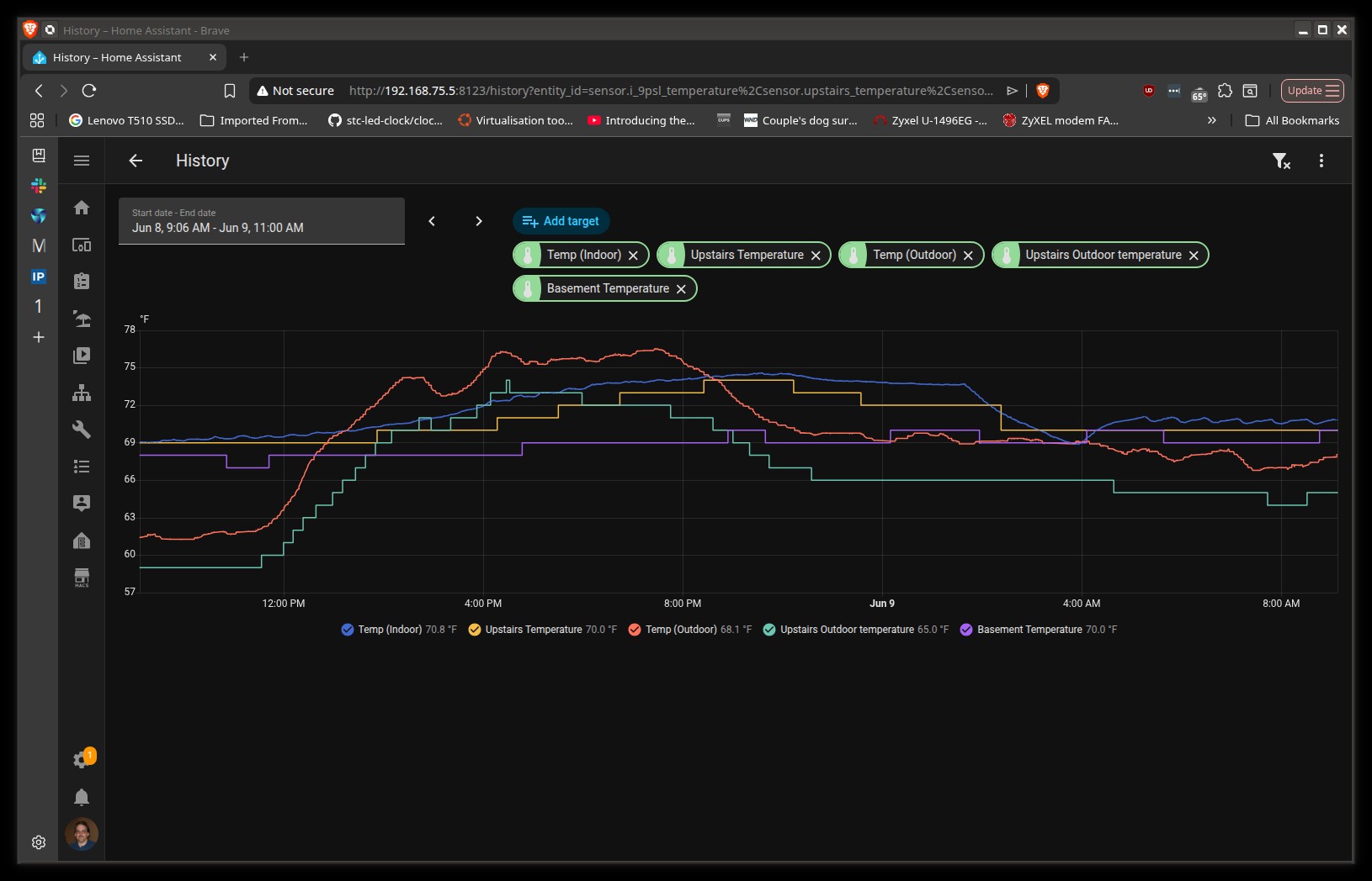
(I have thermostat/humidifier/indoor and outdoor AG, irrigation controls, flood sensors already in HA, and, frankly, the ability to plot data there pretty much makes the AG dashboard look pretty weak by comparison (although I do use both.)
Seriously, why reinvent something that is already mostly there?
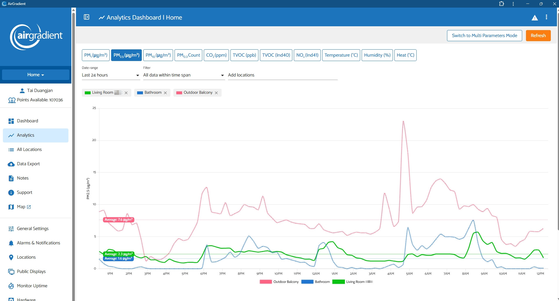
Since you mentioned the data plotting ability, would you mind giving us more details on what makes the AirGradient Dashboard fall behind Home Assistant’s data plotting in your opinion? Thank you again for always being active and giving us feedback!
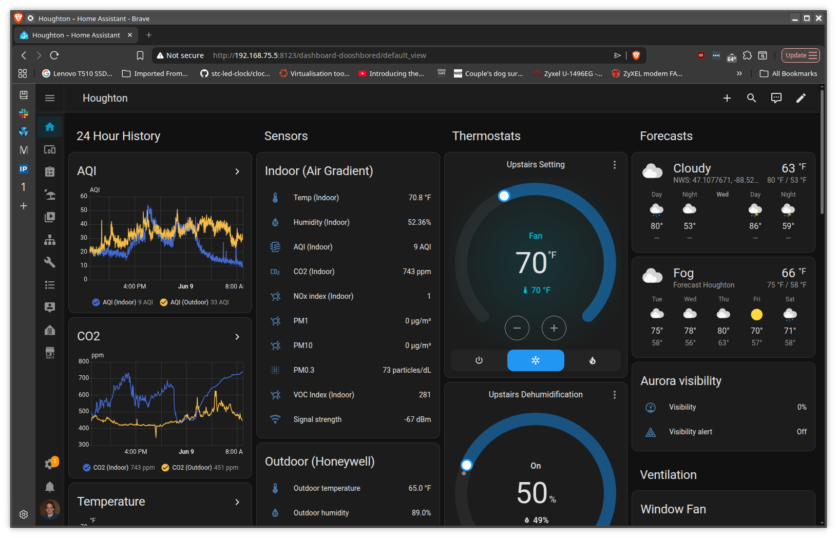
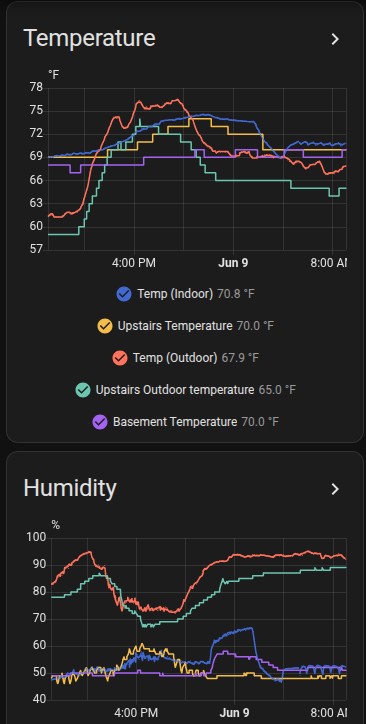
The inability of the dashboard to support multiple items per plot, the severe limitation of values that can be displayed, etc. This is my overall HA dash - granted the AG dash is not intended to show non HA data, but even ignoring the rest of the stuff I display, the ability to display multiple particulate values on the same axis, temps from multiple locations, etc. is notably absent in the HA dash. Heck, unless I missed something, the inability to display more than 4 items at a time in the HA dash can be very frustrating. (Note there are 8 plots on the left - only the first two show without scrolling down.)
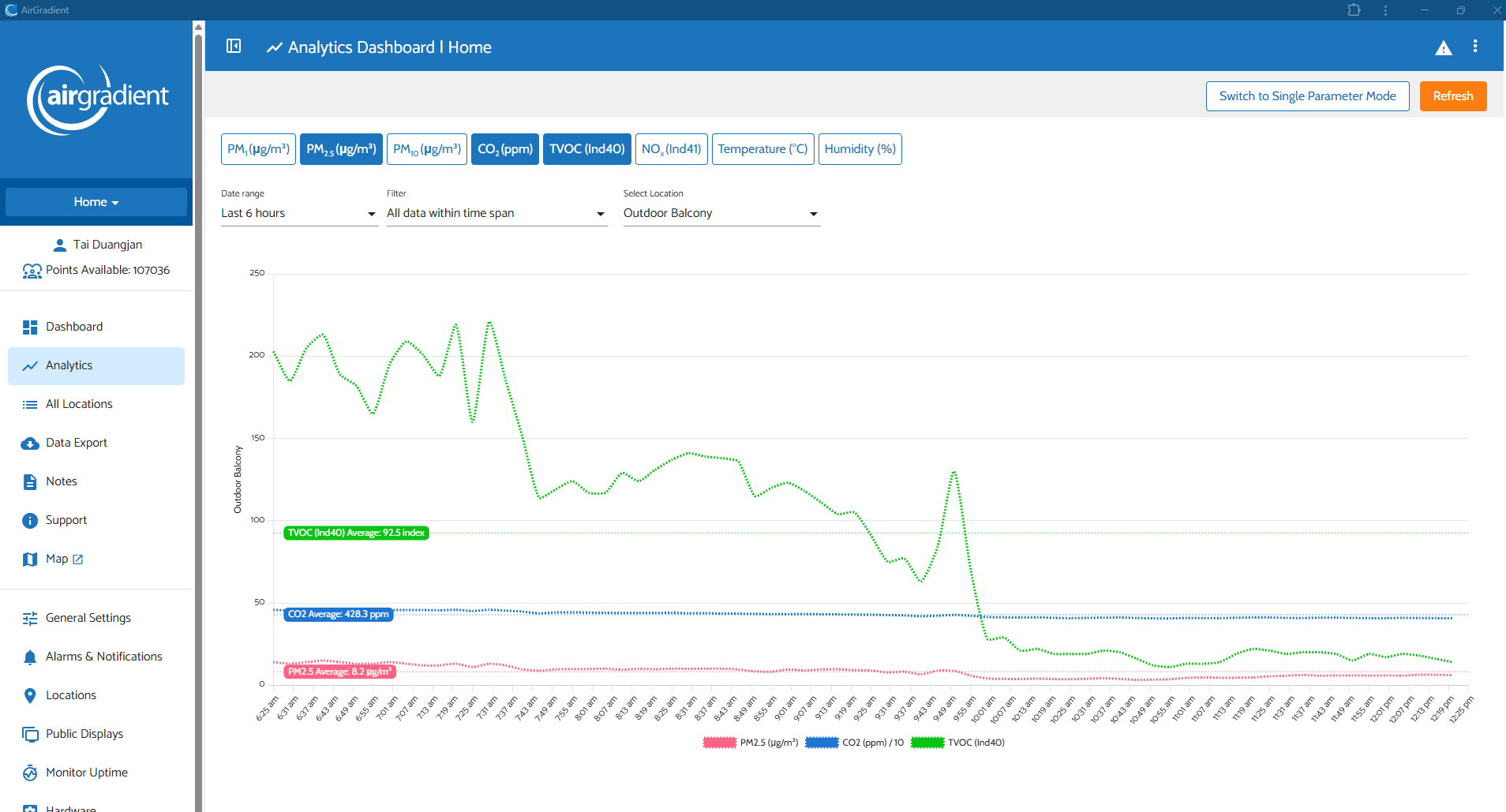
There’s also a ‘Multi Parameter Mode’ (a toggle button in the top right of the screen), which can display multiple pollution types of a single monitor.
Closer (and I never really grasped analytics . . . are they dynamic, or just against historical data?)
Seems also like you can have either multi param on one location, or multi location with a single parameter, not both?
I with I could have fit my entire HA screen in a shot . . . no need to change pages or set anything up. It’s always there one one page, and updates realtime. I can zoom, and select a date range, but otherwise all there with no need to click around.
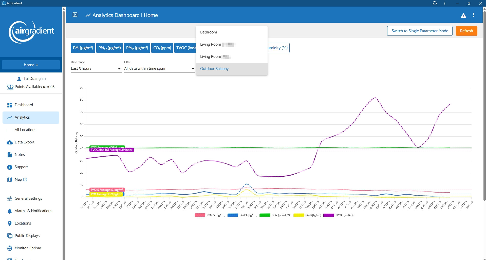
Hi @tadawson , they are historical data. And you are right, in Multi Parameter mode, you can only select one location (a monitor) as shown in the dropdown selector in the attached image below.
I agree that Home Assistant’s chart is quite more flexible as you can interact with it more freely. We will keep this in mind in terms of improving our AirGradient Dashboard!
I’m expecting to receive my AirGradient monitor soon, and I only discovered the Indoor Air Quality Map yesterday. It immediately caught my interest.
Beyond its potential value for research and for raising awareness about indoor air quality, I’m wondering about its immediate usefulness for the general public.
To understand and act on the air we breathe, what seems most actionable is measuring our own indoor air and knowing the outdoor air quality where we live.
I wonder whether seeing indoor measurements from other homes could sometimes be misinterpreted. I’ve already encountered someone who was concerned because a home in their neighbourhood showed poor indoor air quality, as though this implied greater risk in their own home.
AirGradient frequently emphasizes the limitations of TVOC sensors. I wonder if the limitations of the Indoor Air Quality Map should similarly be made clear, so people don’t misinterpret what these measurements actually tell them.
I noticed that TVOC/VOC data cannot be displayed on the Indoor Air Quality Map. I’m curious about the reason for this.
Indoor gases are an important and, in my view, still underappreciated part of indoor air quality. Yet they seem to receive less visibility here as well: users cannot currently use the monitor’s LED colour to visualize TVOC status at a glance, and TVOC is also absent from the public map.
Is this due to the limitations of current low-cost TVOC sensors, concerns about comparing VOC index values between different indoor environments, or another reason?
I often think of air quality as a neglected part of public health, indoor air as a neglected part of air quality, and indoor gases as a particularly neglected part of indoor air.
I’d be very interested to understand AirGradient’s thinking behind not including TVOC on the map.
Hi @Nathalie-Ventilation, I discussed this with our team member. The reason that VOC is not displayed on the indoor air quality map is because of the sensor’s limitations, as you might expect.
Here’s what he mentioned in our discussion:
Index values aren’t comparable. If we showed colours or numbers (like red or 500), people would be worried when they see such a value/number. But, in reality, 500 isn’t necessarily a ‘bad’ reading if the air in which that sensor is located is normally extremely clean. Put it this way: If I had perfectly clean air without a single VOC, simply brewing coffee or opening a bottle of wine next to the sensor could cause it to read 500 despite being totally harmless.
As touched on above, many VOCs are totally harmless. We actually exhale VOCs.
Please feel free to let us know if you have any questions. Thank you!
Thanks, Tai. Your explanation about why the VOC Index isn’t displayed on the map actually brings me back to my original question.
Is this same concern also why users can’t select the VOC Index or NOx Index for the large status LED on the AirGradient ONE?
Because before we even get to displaying VOC data on a public map, people using the monitor in their own homes aren’t alerted through the main visual indicator when their VOC Index becomes elevated.
And this brings me to a more fundamental question: why monitor VOCs in the first place if we then hesitate to make that information visible to users?
I understand that the VOC Index has limitations and cannot tell us which gases are present or whether a high reading necessarily represents a health hazard. But if the information is useful enough to measure, isn’t it also useful enough to communicate with those limitations clearly explained?
That’s really at the heart of my original question.
Scientific research often begins with a hypothesis, informed by what is already known. One reasonable hypothesis to test might be that, in typical indoor environments, when the VOC Index reaches the red range, there is a non-negligible probability that one or more VOCs of health concern are also present at elevated concentrations.
That hypothesis might be confirmed, rejected, or turn out to be true only under certain conditions, but that’s exactly what research could help us determine.
Researchers could test this by selecting a smaller sample of homes and simultaneously measuring the VOC Index alongside reference-grade measurements of specific compounds such as formaldehyde, benzene, toluene, xylenes, styrene and acetone.
We could then begin to quantify something we currently don’t know: when the VOC Index is red in a real home, what percentage of the time does this correspond to elevated concentrations of one or more VOCs of health concern?
If such a relationship exists, even imperfectly, that could help us better understand the informational value of VOC Index data, and potentially make a dataset from thousands of indoor monitors much more useful.
These are very fair points and I want to provide a bit of an update. In the past, the biggest hurdle has been the educational step. With PM2.5 and CO2, there are known thresholds and health advice which we can tie to LED behaviour. If the light is red, you should probably act. If the light is green, there’s no need to worry. Everyone understands that green is generally good and red is generally bad. With VOCs it’s a lot more nuanced, because it’s natural to assume that green means clean air and red means poor air quality. Since it’s an index, a green reading could be hiding a very high VOC concentration and a red reading might actually be completely benign. We didn’t want to cause undue worry or show a reading that would probably lead to more questions than answers, especially when it could mislead people.
But after a lot of internal discussion, we’re planning to add LED support for the VOC Index in the near future. NOx is less certain, though I expect it will follow, since the SGP41 detects NOx events quite well in our testing (The SGP41 Detects NOx Events, But Can You Trust the Number?). This has been heavily requested, and arguments such as your own have made for a good case.
On the map, I’d personally still hold back. A map naturally invites comparison between homes, and the VOC and NOx Indexes are the one value that really can’t be compared that way. Even with the limitations clearly explained, I think most people would still read a red home next to a green one as meaningful. However, this is just my personal opinion.
The research proposal is interesting and something we could explore if any researchers are interested.
Hi Ethan, thanks for your comment. If you don’t mind, I’ll respond in a few separate comments, as there are several points I’d like to share. This is a topic I care a lot about.
In the indoor air quality discussions I follow, I see a lot of discussion about PM2.5 and CO₂, but almost none about gaseous pollutants.
And when gases do come up, I often see people worrying about outdoor gaseous pollutants getting into their homes and trying to keep them out, while paying much less attention to the gases being generated inside the home. Yet, the vast majority of the time, concentrations of many gaseous pollutants are higher indoors than outdoors — even during wildfire events.
There also seems to be reluctance to monitor gaseous pollutants indoors in the first place. And now, even when we do monitor them, there is still reluctance to make that information visible, whether on the LED or on a map.
Sometimes it feels like gaseous pollutants are caught in a strange blind spot in the indoor air quality conversation. So I’m not sure the importance of the issue will necessarily be reflected in the number of user requests.
You wrote that “a map naturally invites comparison between homes, and the VOC and NOx Indexes are the one value that really can’t be compared that way.”
I actually think we can compare homes in both cases, as long as we are clear about what we are comparing and don’t make the data say more than they actually say.
This is already true for PM2.5.
Two homes can have exactly the same PM2.5 concentration while the particles themselves are very different. PM is defined by particle size, not by what those particles are made of or may carry. Particles can contain or carry very different substances, and their health effects can therefore differ considerably.
For example, PM generated during renovation work in a home where asbestos is present is obviously not equivalent to PM generated by minerals aerosolized by an ultrasonic humidifier. Wildfire PM can also have different health effects from PM from other sources.
Yet we still compare PM2.5 concentrations between homes on a map. A reading of 25 µg/m³ tells us that the monitor measured approximately that concentration of PM2.5. It does not tell us that 25 µg/m³ has exactly the same composition or represents exactly the same health risk in every home.
The same principle applies to CO₂.
A map might show 2,500 ppm in two different locations. One could be a bedroom occupied by a couple during the night; another could be a classroom full of children during the day. Those identical CO₂ readings do not necessarily have the same implications. The map also doesn’t tell us whether the room is currently occupied, everyone might have left for work 8 hours ago.
The CO₂ map therefore tells us something quite specific: this monitor measured this CO₂ concentration at this location and time. It does not provide a complete assessment of the risk associated with that concentration.
I’ve also noticed that among many people who became more aware of indoor air quality because of COVID, CO₂ has become so strongly associated with infection risk that this thinking sometimes gets transposed to the home. People may consider 1,200 ppm of CO₂ to be bad, or even dangerous, when it can actually be perfectly acceptable for sleeping at night and a reasonable energy-efficiency compromise, especially when it is very hot or very cold outside, or when outdoor air quality is poor because of smog.
So simply displaying a CO₂ map already carries some risk of misunderstanding. But the solution is not to hide the CO₂ data. It is to educate people about what the data can and cannot tell them, and about how the implications of a given CO₂ level can differ depending on the context.
I think gaseous pollutants should be approached in the same way.
If one home has a high VOC Index and another has a low VOC Index, we should not make the data say something they don’t say. We cannot conclude from the index alone which VOCs are present, their concentrations, or that one home is necessarily more toxic than the other.
But that doesn’t mean the information has no value or shouldn’t be shown. It means we need to explain clearly what the measurement tells us and what it does not tell us. Exactly as we already have to do with PM2.5 and CO₂.
My concern is that by treating gaseous pollutants differently because their interpretation is imperfect, we may unintentionally send the message that gases are less important to monitor. Yet gaseous pollutants are a real indoor air quality issue in many homes.
To me, the solution to imperfect information is not to hide the information. It is to communicate its meaning and its limitations clearly.
Hi Again Ethan, I’m also very glad to hear that you’re planning to let users select the VOC Index for the LED.
And I hope NOx will follow as well. If someone knows they are doing an activity that may generate NOx, being able to see the LED change in real time could be very useful in deciding whether to open a window as a precaution.
That’s one of the great advantages of the LED: you can see the color from across the room and keep doing what you’re doing, without having to constantly check the dashboard or the numbers.
Hi Ethan, I’m new to the forum and still getting used to how discussions work here. I had several points I wanted to respond to, and rather than posting one extremely long comment, I decided to separate them into a few replies.
As I was about to post my third and final response, the forum displayed a message asking me to avoid posting several replies in a row and to consider combining them into a single reply instead.
So I’m wondering whether you feel I’m commenting too much here, or whether this kind of detailed discussion is welcome. I have quite a lot to say on this topic, but I also don’t want to impose on the discussion. I’m simply trying to understand what works best here.
I’ll wait for your response before posting my last comment.
@Nathalie-Ventilation, you’re welcome to continue the discussion and we welcome it! The filter is mostly to stop spam, because it assumes that several replies in a row mean spam. Please feel free to reply to this comment and we can get back to you in full!
Okay, thanks Ethan for letting me continue my thought on this.
I’d like to come back specifically to your concern about displaying the VOC Index on the map, because I wonder whether part of the difficulty may actually start earlier, with the way we communicate what the VOC Index is for and what people should do with it.
You wrote:
“Everyone understands that green is generally good and red is generally bad. With VOCs it’s a lot more nuanced, because it’s natural to assume that green means clean air and red means poor air quality. Since it’s an index, a green reading could be hiding a very high VOC concentration and a red reading might actually be completely benign. We didn’t want to cause undue worry or show a reading that would probably lead to more questions than answers, especially when it could mislead people.”
I understand the limitations you are describing. But I wonder whether focusing so strongly on those limitations, without also giving users clear guidance about when the signal should lead to attention or action, may itself contribute to the difficulty of displaying the VOC Index on a map.
I noticed something interesting when comparing different explanations of the VOC Index.
In AirGradient’s article Explaining VOCs, TVOC and the VOC Index, the limitations of the measurement are explained in considerable detail, but I don’t see clear recommendations about what users should actually do when the VOC Index rises significantly. To me, this is a missed opportunity to make the measurement more useful to the general public.
Altair Sheikh. January 6, 2026. Explaining VOCs, TVOC and the VOC Index. AirGradient Blog.
By comparison, I found two texts that, in my opinion, do a better job of connecting an imperfect measurement to action, while still explaining its limitations.
In the first one, the word “Actions” is actually in the title. It explains the limitations of the VOC Index but also gives practical examples of actions that can be considered in response to different readings.
VisiblAir. Reviewed and updated August 3, 2026. VOC Index Meaning: Scale, Baseline and Actions.
The second is Sensirion’s own technical documentation. It also explains the relative nature of the VOC Index and its adaptive baseline, but explicitly connects the measurement to action. Sensirion gives the example of mapping a VOC Index value to an action performed by a device, such as triggering an air purifier above a certain threshold.
S ensirion. What is Sensirion’s VOC Index?
I think this distinction is directly relevant to the map discussion.
We don’t need a perfect measurement, or complete knowledge of which VOCs are present and at what concentrations, before a measurement can be useful for making precautionary decisions. We often have to act on the best information available, while understanding its limitations and using judgment.
If my VOC Index suddenly turns red at home, I don’t need that red light to tell me, “the air is dangerous.” But I do want it to tell me, “something significant has changed; pay attention, look for a possible source, and consider ventilation.”
In other words, red does not have to mean “danger” for red to mean “attention or action may be warranted.”
And this is where I see a direct connection between the usefulness of the VOC Index in one home and the usefulness of displaying it on the map.
If a red VOC Index in my own home can tell me that something may deserve attention or action, then seeing the same thing occurring across many homes can also tell us something useful.
A red home on the map would not mean “this home is dangerous,” just as a red LED in my own home would not mean “my air is dangerous.” In both cases, it can mean: something is happening here that may deserve attention or action.
And when we move from one home to hundreds or thousands of homes, that becomes interesting information in itself. If many participating homes are frequently showing high VOC Index values, it could suggest that VOC events potentially warranting attention or action are common in real homes. If most homes remain near their usual baseline most of the time, that tells us something too.
We could also begin to see how often these events occur, how long they last, how frequently monitors return toward green, and whether patterns emerge across homes, seasons or times of day.
So to me, the usefulness of the map follows naturally from the usefulness of the measurement at home: if the VOC Index can help one household recognize when something may deserve attention or action, aggregated VOC Index data can help us understand how often those situations may be occurring across many households.
The map would still not tell us which VOCs are present, their concentrations, or the exact health risk in each home. But it could give us a picture of something we currently know very little about: how frequently high VOC Index readings occur inside real homes, and how long they persist.
This is why I think defining what should trigger attention or action is so important. Without that, the VOC Index risks becoming a measurement we collect but hesitate to use.