AirGradient Onboarding & Dashboard Improvements

One of our main focus at the moment is to make the onboarding and software experience with AirGradient much better. Currently it is quite rough around the edges and a number of users get lost.

What we already identified is:
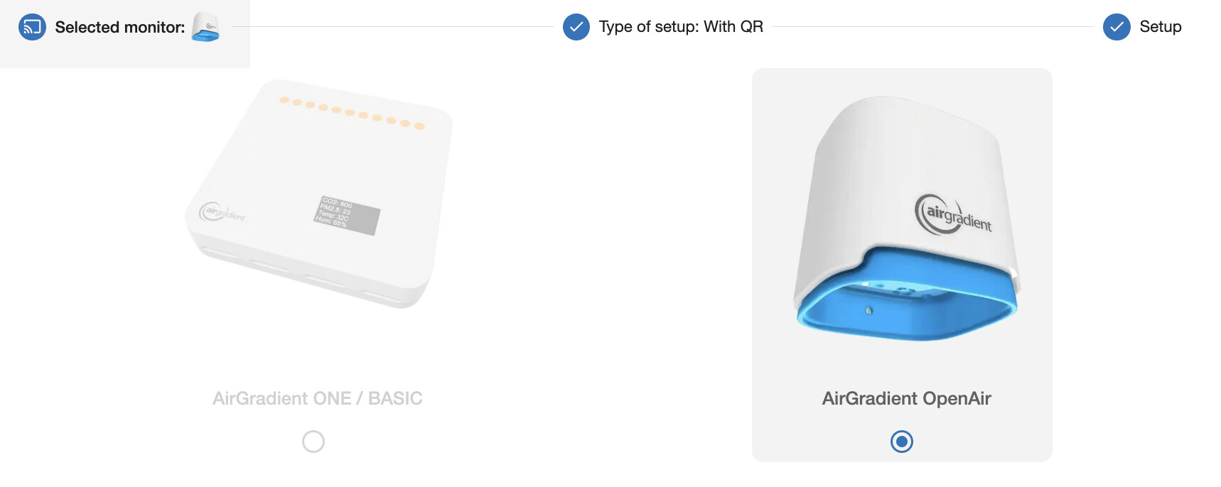
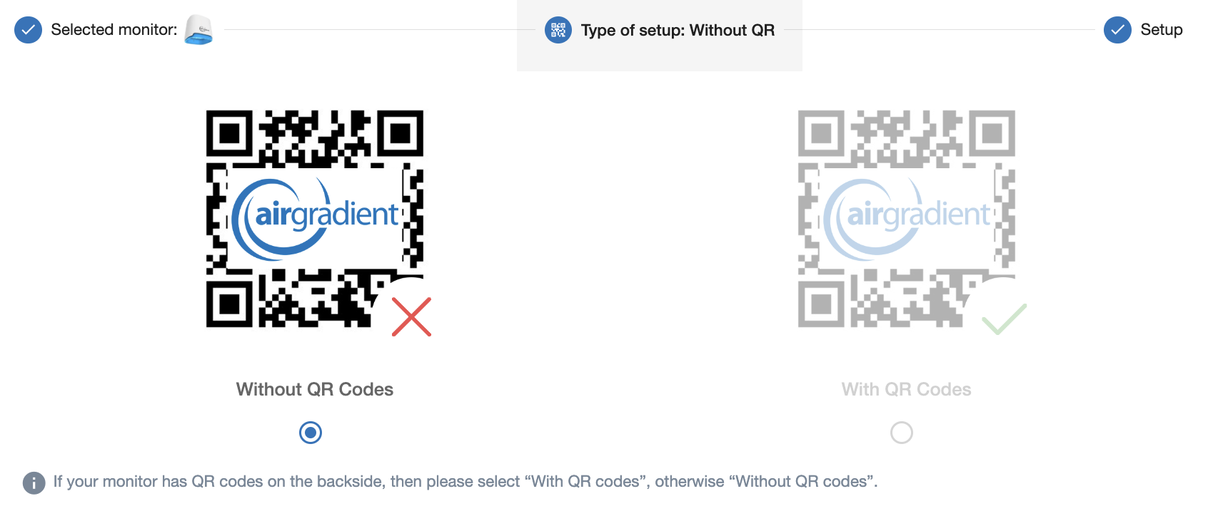
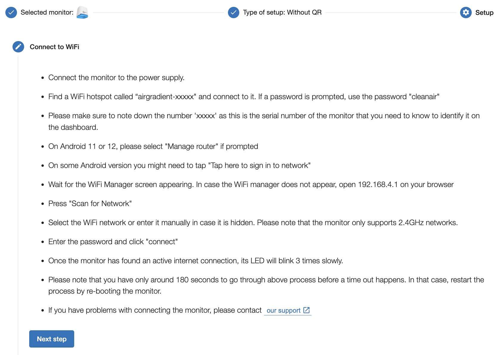
Onboarding

  • Ensuring that the card with the QR code pointing to the instructions is in every box
  • Clearer instructions on WiFi connection
  • Give clearer instructions if errors are displayed on the monitor (e.g. instead of Config Error say “Register monitor on dashboard”)

Dashboard

  • Much more help in setting up the sensors
  • Integrated help to explain air quality parameters, normal ranges and health impacts
  • Different dashboard configurations for different purposes and personas. Simple ones with more qualitative air quality scores, explanations for “normal” people but also more ones for people that want to have a closer look at the data.
  • Hide outdoor box completely if no outdoor monitor is connected

It would be great if we could have a discussion here which new features you would like to see and also how we can improve existing ones.

2 Likes

Good ideas. Here’s two more:

  1. Speaking of personas - a dashboard home page for customers with 1-4 (or so) sensors. The current dashboard is great for helping users with lots of sensors figure out which ones they should look at, but a user with a few sensors already knows that.

    A home page for 1-4 sensors could be the locations table, then inline one chart for each metric collected, or if that’s too intensive, for the metrics that AG considers most interesting (CO2, PM2.5, TVOC, humidity?). Each chart would have one plot line for each sensor. (Users could click any sensor to go to a page with plot lines for only that sensor.)

    A user with 1 sensor would be able to see all their charts right on the dashboard. If/when they added a 2nd sensor, they’d see both readings on the same chart so it’s easy to spot patterns. At 5+ sensors, the home page would shift more towards the current summary view.

  2. URLs for the different pages, so it’s easy to go straight to the charts for a sensor or metric (or whatever you think users will want to keep an eye on).

One more idea: when adding a new sensor (where they pick the location), let the user choose C or F for the temperature display (on the device screen). Have the sensor reconfigure itself.

When a user adds their first sensor and chooses the temp units, also use that as the default dashboard temp units. Best case, they only have to think about C/F once when they add the first sensor, and everything else - dashboard and future sensors - defaults to that choice.

We actually already implementing this in the new firmware. We will take the country setting. US = F, Rest of the world, C.

1 Like

Two more:

  • Display reboots on the graphs, at least for any metric where the reboot may make pre-reboot and post-reboot readings not comparable. That’s at least TVOC and if CO2 ABC is not persisted across reboots, CO2.
  • When viewing a graph, update the graph as new data arrives instead of showing “New version available. Please update!”

The 2nd point is not related to data update. It is showing up when the front end app has received an update. Shown because it is a PWA and thus locally cached.
Re 1st point I don’t understand you you mean. Can you please explain a bit more?

CO2 ABC isn’t changed after a device reboot, so that is a non-issue.

But since the baseline for TVOC does reset when the device resets, Troy is asking for some way to be able to correlate a significant change in TVOC with a reset of the boot counter

On the first point, what @MallocArray said. As an example, in this experiment the VOC reading suddenly and inexplicably changed. Folks theorized that it was a reboot.

Whether or not that specific example was a reboot, we collectively learned that a reboot will change the VOC scale. So, anyone trying to make heads or tails out of a VOC chart needs to see when reboots occur. Sounds like this is specific to VOC, not CO2, though I think showing reboots on all charts may be worthwhile (sometimes it will indicate the device being physically moved).

On the second point, makes sense. In that case, my wish is just for realtime streaming data.

@MallocArray @troy yes that is a good suggestion. I will put on our to do list and discuss with our developers.

I think the registering of sensors could be more robust. I e.g. had a problem where my phone uppercased the first letter in the seensor id. It was added, but failed to upload data.

I also had some issue where I added it as a sensor but not as a location. I believe I couldn’t upload data to it when I did that. (Could be other fingertrouble on my part)

The third stumbling block I have hit, is when I have forgotten to note down the serial number to register it. It is visible at boot, but only for a short time, which makes it hard to read (needs many reboots to write it down). I think that if sentToServer() fails with a code that indicates that the hardware is not registered, you could show “please register serial number” on the screen, at least for a few seconds, to let it still show values in the display. Maybe only have that the first minute or two after powering on?

Finally, the O_1PST doesnt write the response on error to serial, which means you need to compile and flash it to figure out what is wrong.

2 Likes

Hi @Jorgen_Austvik! Thank you for your feedback and ideas!
Improving the onboarding and registering sensors flows are key priorities for our team right now, so suggestions like yours are exactly what we need. We will fix the uppercase issue and find the best way to resolve the others.

We have addressed some of these issues in the latest firmware update version 3. It now shows the serial number for 10 seconds and we also show better error messages that should be easier to understand.

1 Like

@Achim_AirGradient One more tiny improvement: right now, the “No Outdoor Data Available” box shows at the top of the mobile view and is not dismiss-able. Users need to scroll past it every time they load the dashboard. Either (a) make the “No data” box dismiss-able, or (b) for customers who only have outdoor or indoor sensors, show the section that has sensors above the “No Data Available” section.

Setting up wifi seems like a place where users can get stuck. After I pair my phone to the airgradient, it doesn’t seem to go into the captive portal screen right away. I usually end up browsing to 192.168.4.1 instead of waiting or trying to reconnect to get the captive portal screen to come up. If I hadn’t seen the network details come up on the serial log I don’t know what I would be doing.

After flashing the esphome voice assistant firmware to a device, the firmware flashing page showed a menu where I could set up wifi over USB. Getting a computer with chrome connected over USB might be an obstacle to some, but maybe it’s an option to consider.

I recently configured a device that prompted my iphone to share wifi network credentials, which made set up very easy. I think this might be something proprietary to apple devices, but maybe android has done something similar?

Kai

Yes these boxes are not pretty right now. We plan to give flexibility to these tiles, e.g. to use them to display more detailed data for the sensors that one has already running, e.g. a chart etc.
In general we are making great progress on the dashboard right now so I believe we will have something here soon.

We have recently upgraded the onboarding progress with detailed descriptions on how to setup the Wifi. It can be accessed here:

AirGradient

It’s still not ideal to provision over WiFi so we are also looking at alternatives but so far we did not come across good solutions besides making our own app and provision over BLE (which could have it’s own kind of issues).

Screenshots: