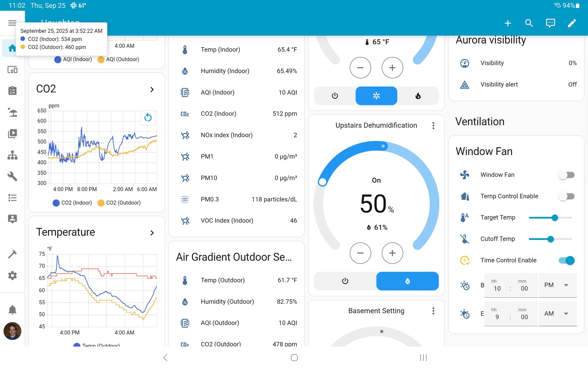
I don’t know if this is the sort of thing you are after. There are two ways that I use to display real time graphs, including AG, in Home Assitant:
- Multi graphs
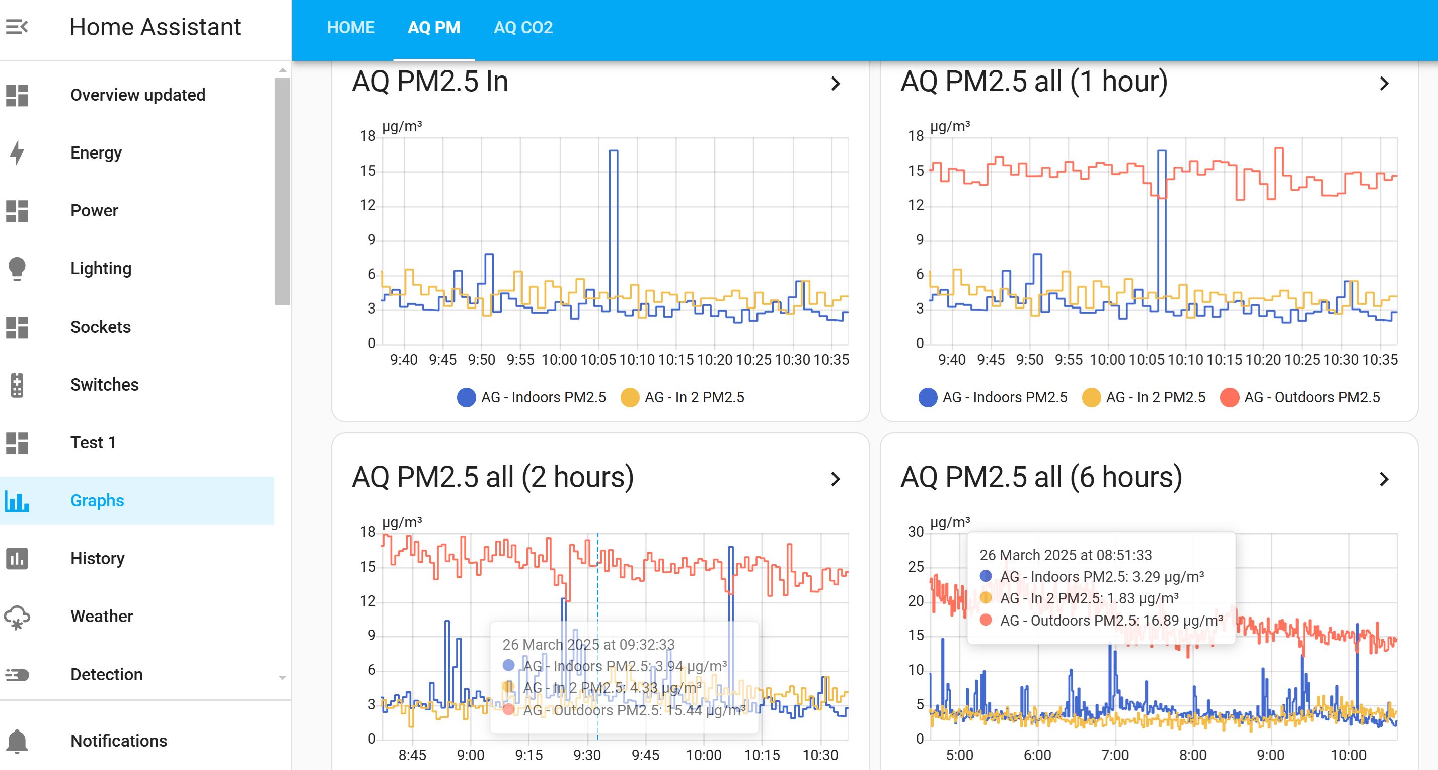
I created the multi graphs in History (select the entities you want from the Choose entity tab). I then created cards for these by clicking on the three vertical dots button then ’ Add current view as card’. You will then be given the option to select the desktop where you want the card displayed.
I had already created a desktop called Graphs and put the cards in there.
The information is displayed in real time and the time scale can be edited once the card is in the desktop by going into Edit dashboard (on that dashboard) then editing that graph. If you want multiple time scale cards, then just duplicate the card and edit the time.
Note - I found that I could show the same type of entity (e.g. PM2.5) from diferent monitors in the same graph window, but if I selected a different type (e.g. Carbon dioxide), then that was put in a new window below.
- Single graphs
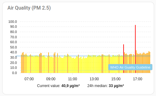
These graphs were created from the Sensor graphs card (the one that shows a graph) in the available cards list. These are displayed in real time, the time scale can be modified in the card settings.
I also put these graphs in a separate dashboard for convenience (I find these graph cards very useful for an instant at-a-glance view). The dashboard uses the new sections feature which makes it very simple to place the cards where you want and use smaller cards…