Thanks, @Ethan_AirGradient! Somehow it didn’t even occur to me to try clicking on those, probably in part because I was testing mainly with a tablet, which doesn’t really have the hover states going over the numbers.
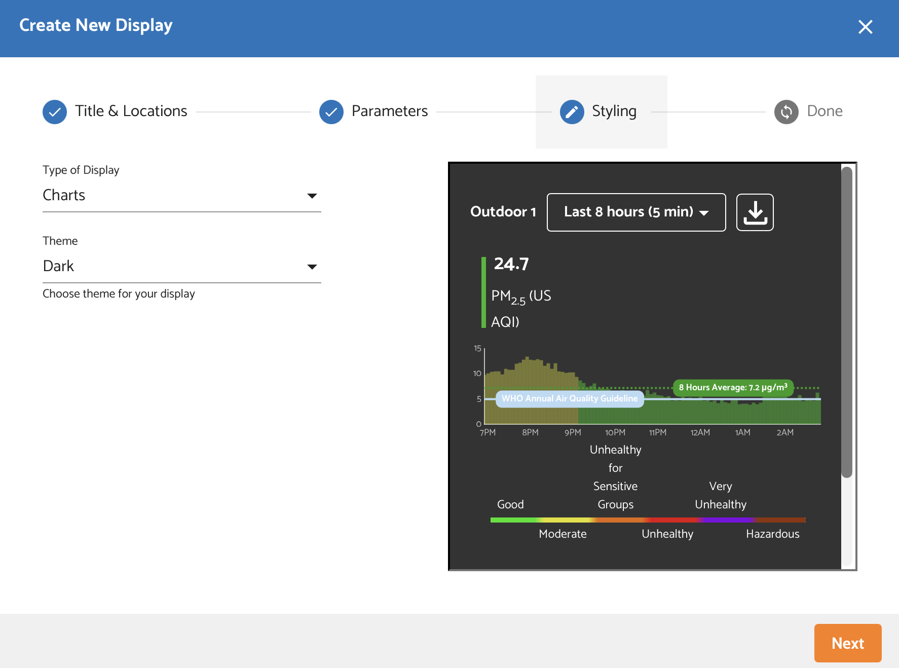
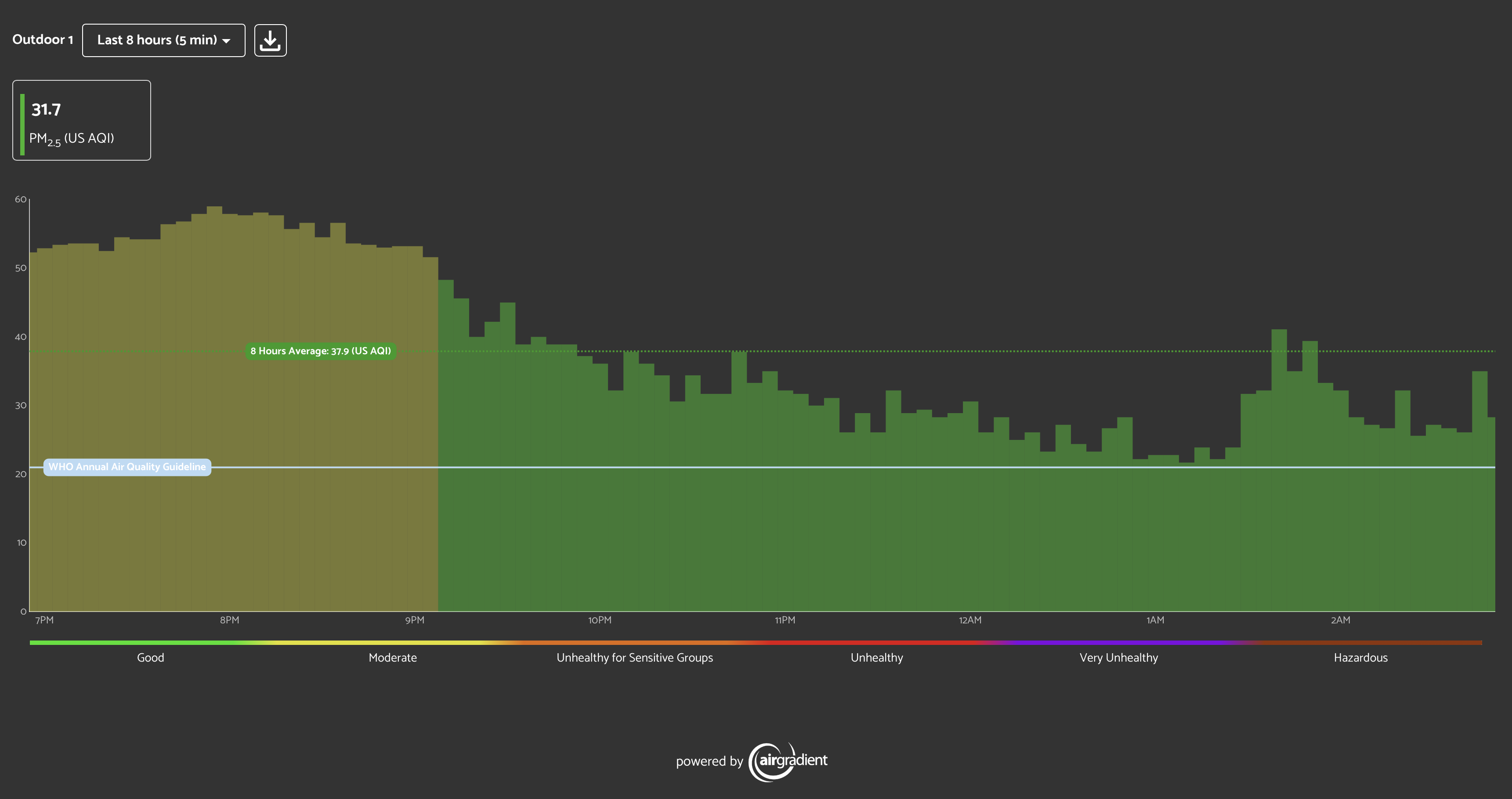
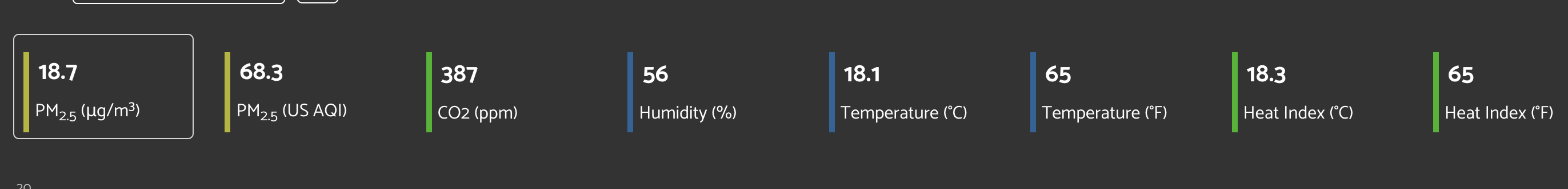
I think the UI is just a tiny bit confusing, especially when you uncheck the ug/m3 option for the widget. It seems the graph always defaults to ug/m3, even when it isn’t a selected parameter for the widget. If your widget does include that parameter, you see it in the chosenMeasure state like this, with a white border around it:
Just seeing the border around it makes it clear that it’s selected.
But if the widget doesn’t include ug/m3, nothing is in the active state, and the default graph doesn’t even correspond to any of the numbers. I was going to include an image demonstrating this, but I’m a new user and can only include one upload, and your first image actually demonstrates it anyway.
Long story short, I think it would also be nice if either:
- You can select which metric should be the default graph (choices limited to what’s been included for the widget)
- The widget defaults to displaying a graph for a metric that is actually included.
Thanks again!