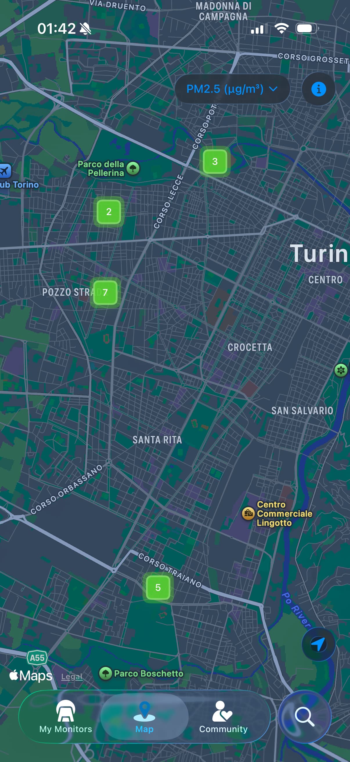
I really appreciate AirGradient Map because it allows you to see air quality in real time and zooming in from a larger scale to a local one.
Looking at my City I noticed that some sensors were systematically way off both from nearby sensors and other reliable data or forecasts.
In the picture below there is such an example: the circled sensor has a PM2.5 measured value of 5 (micrograms per metric cube) while others in the city are in the 20 range. I took a look to the last month average of that sensor and it was 6.9 (micrograms per metric cube) while an enviromental monitoring staton placed 3.5km from tthe sensor has a monthly average of 28.7. So I’m pretty confident the figures reported from the circled sensor are roughly 25% of validated data from reference instruments of the local enviromental agency.
Now if we zoom out we’ll see an average where 2 sensor vastly underestimate PM2.5 and this will give a wrong value for the entire city.
I think this is not easy to fix, but validating sensors on the map with reliable reference data could improve very much the reliability of the data displayed on the map.
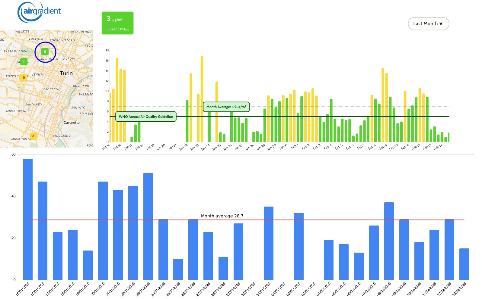
The data in the blue bar chart below was downloaded from the Regional Environment Protection Agency (ARPA Aria | Arpa Piemonte )